
A WALLSIDE FRAMING STUDY
How to choose a frame for an artwork
Compare light oak and dark walnut around the same painting. Start with the picture, then decide how much presence its frame should have.
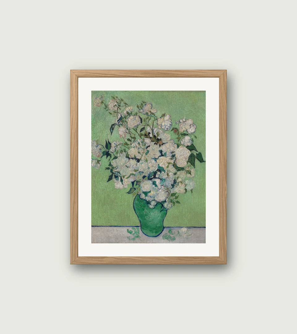
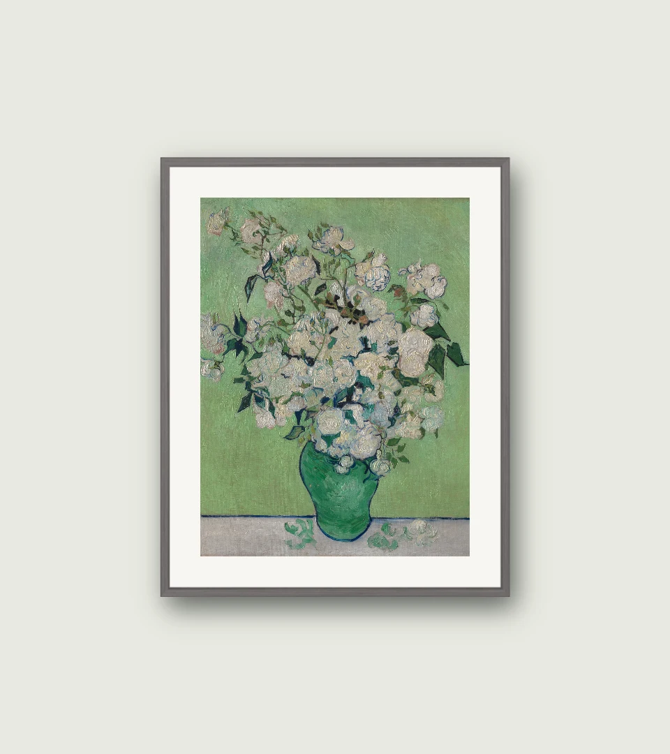
Digital framing studies made in our browser tool. Artwork: Roses, Vincent van Gogh. Original image and source credit are on the artwork page. Previews use a fixed opening and may crop the original.
Begin with the picture
Look at the largest light and dark areas before choosing a material. In these previews of Roses, light oak sits close to the warm paper and petals. Walnut makes a darker boundary around the pale painting. Neither is a rule: they give the same artwork a different emphasis.
Change one thing at a time
Keep the wall and mat identical while comparing frames. This makes it easier to tell whether you like the frame itself or the whole arrangement. Look away for a moment, then look back. Notice whether your eye reaches the roses or the border first.
Give the frame a job
Try a light frame when you want the edge to feel quieter. Try a darker one when the picture needs a clearer boundary against a pale wall. Echoing a small dark tone in the painting can help the border feel connected without matching every colour.
Check the whole composition
Review the preview at a small size as well as close up. The browser tool uses a fixed frame opening and can crop the image; check that the edges of the composition still work. A digital preview is a starting point for the look, not a physical framing specification.