
A WALLSIDE FRAMING STUDY
How to pair an artwork and frame with a wall colour
Compare a warm pale wall and a deep graphite wall without changing the artwork, frame or mat.
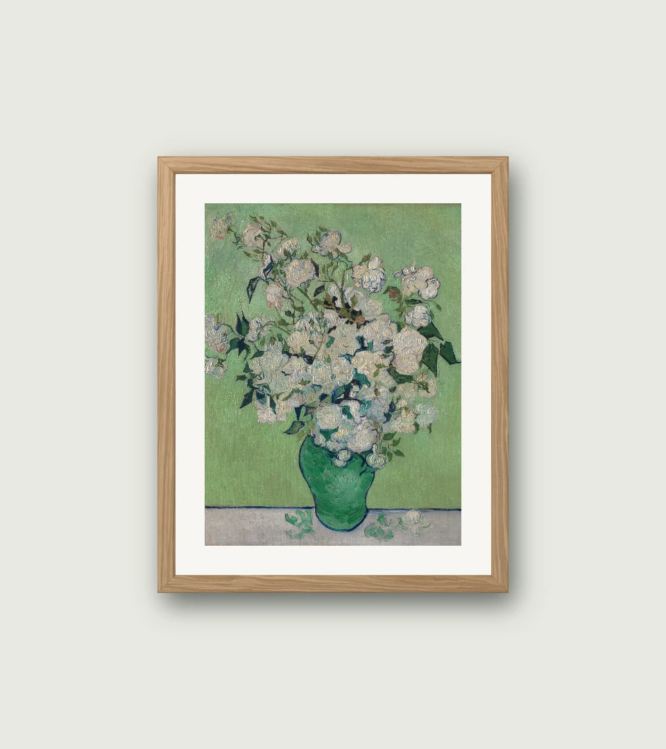
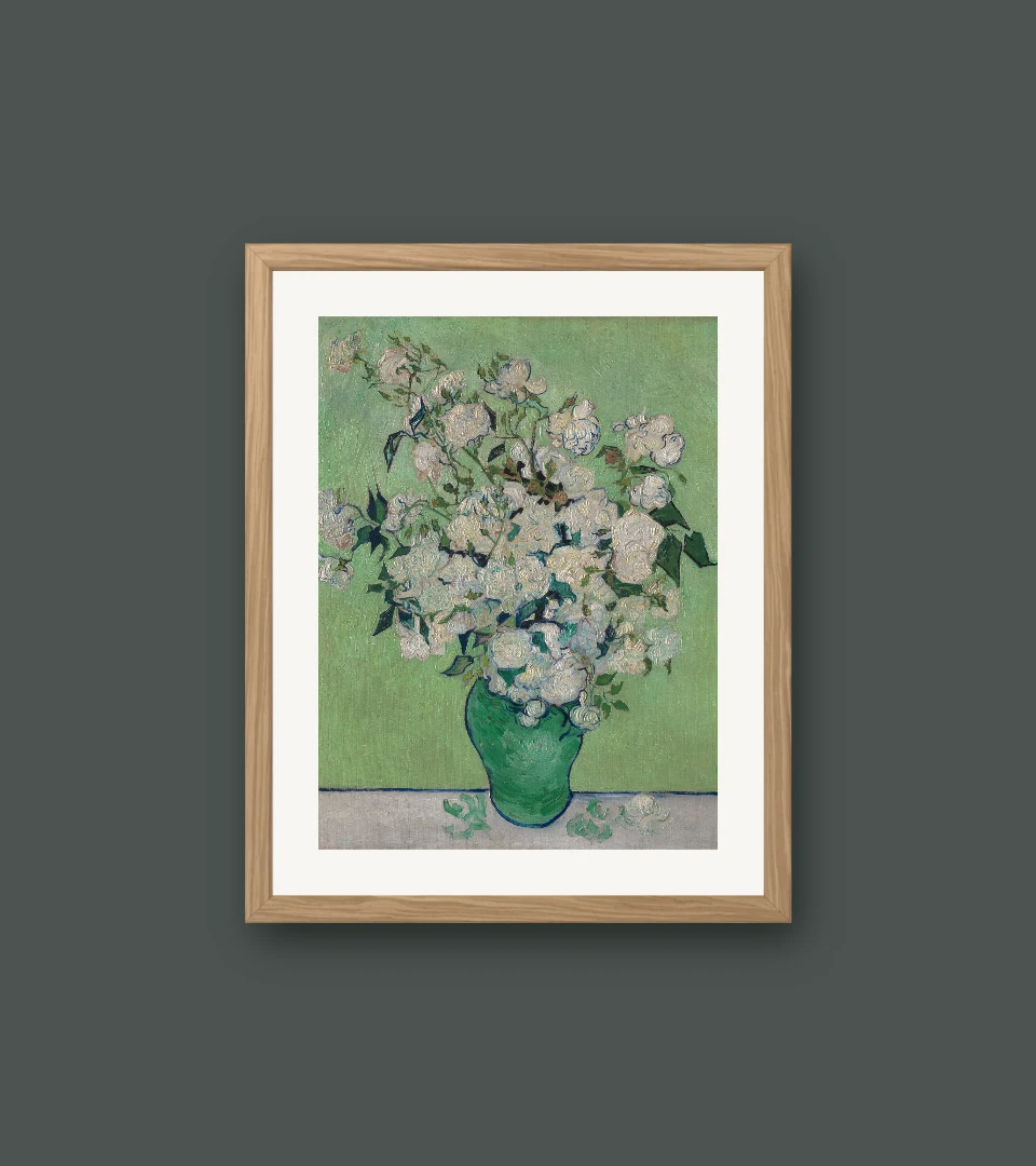
Digital framing studies made in our browser tool. Artwork: Roses, Vincent van Gogh. Original image and source credit are on the artwork page. Previews use a fixed opening and may crop the original.
Keep the picture constant
Start with a frame and mat you already like. Change only the wall colour. The pale wall in this example keeps the whole arrangement close in tone; graphite gives the light mat and roses a stronger contrast with their surroundings.
Decide what should stand out
On a pale wall, notice whether the frame needs a little more definition. On a dark wall, notice how much attention the bright mat attracts. A dramatic contrast can be lovely, but it can also draw your eye to the rectangle before the artwork.
Look beyond a colour match
A wall does not need to repeat the painting’s most obvious colour. Try a muted wall that leaves room for the picture. If you pick out a colour from the artwork, compare a quieter version as well as a close match.
Return to the room
Screen brightness, room lighting and surrounding furniture all change how a colour feels. Use the preview to narrow your choices, then view physical paint and frame samples in the room at different times of day. The tool’s wall is a digital colour study.