
A WALLSIDE FRAMING STUDY
How much mat should you leave around a picture?
Compare a narrow and a generous mat. See how the space around an artwork changes its apparent size and rhythm.
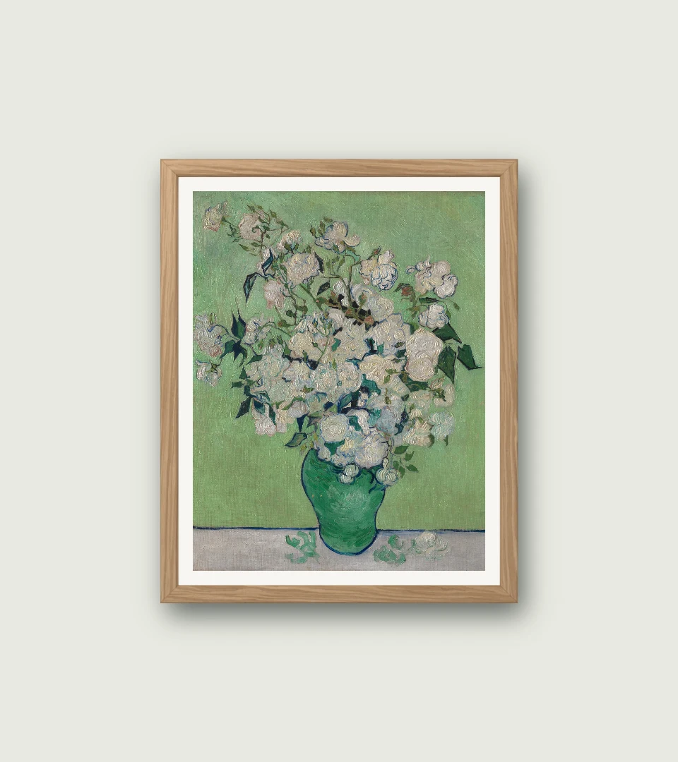
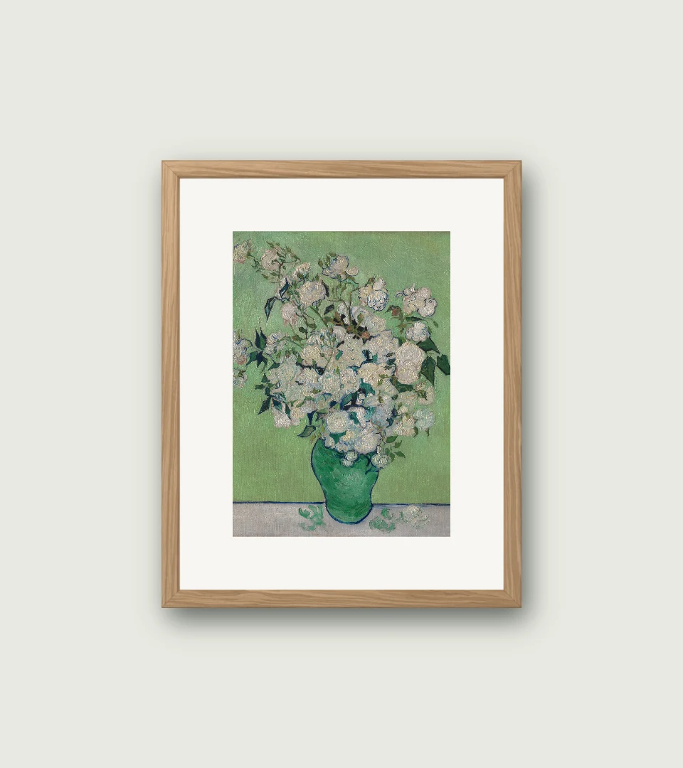
Digital framing studies made in our browser tool. Artwork: Roses, Vincent van Gogh. Original image and source credit are on the artwork page. Previews use a fixed opening and may crop the original.
Treat the mat as space
A mat gives the picture a pause before the frame. Here the narrow mat keeps Roses relatively large inside the opening. The wider mat introduces more pale space and makes the painting feel more contained. The frame and wall stay the same in both previews.
Start in the middle
Try the tool’s default 34 mm width, then move towards 16 mm and 60 mm. These are comparison settings in the digital tool, not recommended cutting measurements. Stop where the space supports the image without making its details feel remote.
Watch the colour as well as the width
Warm ivory and bright white can create noticeably different edges beside pale paint or paper. Keep the colour fixed while choosing the width, then compare colours separately. A wider mat makes its colour more prominent.
Check your image edges
The tool centres and crops the artwork to a fixed opening. Changing the mat also changes that opening’s proportions, so inspect important details near every edge. For a physical frame, measure the actual print and agree the visible image area with your framer.